


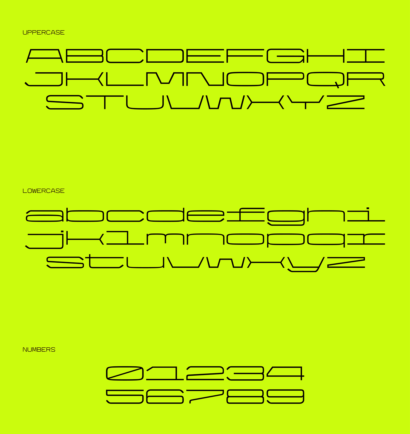
STEEL MONO was created for IED (Istituto Europeo di Design), in collaboration with the Italian foundry CAST - Type foundry. The shapes that have outlined the font have been realized thinking about a scientific and technical imaginary, a font therefore usable in well-defined areas but with the possibility of second ends and uses.
The character that emerged is a linear mono spaced in three versions: regular, extended and ultra extended. Three sizes with three uses, from the readability that offers the regular to the display version and scope to the limit of the ultra extended.
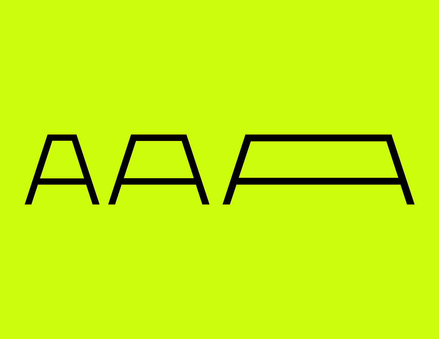
The shapes of the character recall the imagery mentioned above and have a peculiarity that makes it unique and recognizable compared to all the other characters: the endings of some letters. In letters like C, S, a, y, etc, the external curve of the termination does not coincide with the internal one: the first one maintains a stable curve and in line with the other curves presents in the letters, the inner ones are closer to an angle, thus creating a slight visual imbalance that acts as a filling of white spaces as well as making it the stylistic feature.
The character that emerged is a linear mono spaced in three versions: regular, extended and ultra extended. Three sizes with three uses, from the readability that offers the regular to the display version and scope to the limit of the ultra extended.
The shapes of the character recall the imagery mentioned above and have a peculiarity that makes it unique and recognizable compared to all the other characters: the endings of some letters. In letters like C, S, a, y, etc, the external curve of the termination does not coincide with the internal one: the first one maintains a stable curve and in line with the other curves presents in the letters, the inner ones are closer to an angle, thus creating a slight visual imbalance that acts as a filling of white spaces as well as making it the stylistic feature.


Thank you so much!!
Check my IG profile: pianosi_riccardo


